181 min to read
Basic Data Visualiztion in Python
Using matplotlib

Introduction to Basic Visualizations in Python 
The basic question of when I should use which chart is explained here.
The type of graph you use is important. It's important for telling the story of data, that your assocications are not mis-interpreted.
Plot Types
Bar Plots
Usage: When Comparing the same varibales in the same category or datasets.
Do not use: More than 3 categories of variables or when trying to visualze continuous data.
import matplotlib.pyplot as plt

numbers = [500, 800, 900, 1000, 1400, 1600]
widths  = [1.0, 1.0, 1.0, 1.0, 1.0, 1.0]
colors  = ['b','b','b','b','r','b']

fig, ax = plt.subplots()

plt.bar(range(6), numbers, width=widths, color=colors, align='center')

plt.xticks(range(6), ('2016','2017', '2018', '2019', '2020', '2021'))

ax.set_ylabel('Billions')

plt.title('GDP Prediction')

plt.show
Line Plots
Line plots are the most common
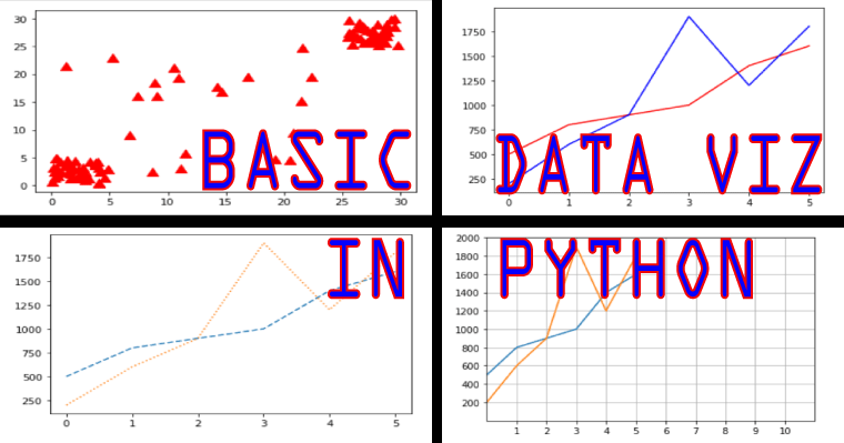
Usage: When you are tracking and comparing several variables across time, analyzing trends and variation and predicting future values.
Do not use: To get an general overview of your data or analyzing individual components or sections.
plt.plot(range(6), numbers)
plt.show()
Drawing mulitple lines and plots
numbers2 = [200, 600, 900, 1900, 1200, 1800]
plt.plot(range(6), numbers)
plt.plot(range(6), numbers2)
plt.show()
Setting the Axis, Ticks, Grids
#use an alyusis for the axis fuction
ax = plt.axes()

# changing the x axes and y axes limit (making them longer)
ax.set_xlim([0,11])
ax.set_ylim([-1,11])

# changing the x axes and yaxes ticks
ax.set_xticks([1, 2, 3, 4, 5, 6, 7, 8, 9, 10])
ax.set_yticks([200, 400, 600, 800, 1000, 1200, 1400, 1600, 1800, 2000])
plt.plot(range(6), numbers)
plt.plot(range(6), numbers2)
plt.show()
Add Grids
#use an alyusis for the axis fuction
ax = plt.axes()

# changing the x axes and y axes limit (making them longer)
ax.set_xlim([0,11])
ax.set_ylim([-1,11])

# changing the x axes and yaxes ticks
ax.set_xticks([1, 2, 3, 4, 5, 6, 7, 8, 9, 10])
ax.set_yticks([200, 400, 600, 800, 1000, 1200, 1400, 1600, 1800, 2000])

# add Grids
ax.grid()
#plot
plt.plot(range(6), numbers)
plt.plot(range(6), numbers2)
plt.show()
Change line appearence
# '-' Solid Line
# '--' Dashed Line
# '-.' Dash Dot Line
# ':' Dotted Line

#plot
plt.plot(range(6), numbers, '--')
plt.plot(range(6), numbers2, ':')
plt.show()
Use Colors
plt.plot(range(6), numbers,  'r',)
plt.plot(range(6), numbers2, 'b',)
plt.show()
Adding Markers
Options Can be found here: https://matplotlib.org/api/markers_api.html
plt.plot(range(6), numbers,  'o--')
plt.plot(range(6), numbers2, 'v:' )
plt.show()
Change Color on Markers
plt.plot(range(6), numbers,  'ro--')
plt.plot(range(6), numbers2, 'bv:' )
plt.show()
Add Labels
# labels
plt.xlabel('X axis label')
plt.ylabel('Y axis label')

plt.plot(range(6), numbers,  'ro--')
plt.plot(range(6), numbers2, 'bv:' )
plt.show()
Annotating the Chart
# Annotating
plt.annotate(xy=[0,500], s='Make a point')
plt.annotate(xy=[5,1500], s='Make another point')
# plot
plt.plot(range(6), numbers,  'ro--')
plt.plot(range(6), numbers2, 'bv:' )
plt.show()
Create a Legend
plt.plot(numbers, label="test1")
plt.plot(numbers2, label="test2")
# Place a legend to the right of this smaller subplot.
plt.legend(bbox_to_anchor=(1.05, 1), loc='upper left', borderaxespad=0.)

plt.show()
Scatter Plots
Usage: When analyzing indivudual points, looking for outliers, fluctuations, general overview of variables
Do not use: when looking for precision, one dimensional data, non numerica/categorical data
import numpy as np
import matplotlib.pyplot as plt

# creating arrays
# rand generates from distribution [0, 1)
x1 = 5 * np.random.rand(40)
x2 = 5 * np.random.rand(40) + 25
x3 = 25 * np.random.rand(20)

# combining all these arrays and creating a list
x = np.concatenate((x1, x2, x3))

y1 = 5 * np.random.rand(40)
y2 = 5 * np.random.rand(40) + 25
y3 = 25 * np.random.rand(20)
y = np.concatenate((y1, y2, y3))

# s is the size of each data point
# marker is the shape of each data point
# c is the color
plt.scatter(x, y, s=[100], marker='^', c='r')
plt.show()
Scatterplots are especially important for data science because they can show data patterns that are not obvious when viewed in other ways. You can see data groupings with relative ease and help the viewer understand when data belongs to a particular group.
import numpy as np
import matplotlib.pyplot as plt

x1 = 5 * np.random.rand(50)
x2 = 5 * np.random.rand(50) + 25
x3 = 30 * np.random.rand(25)
x = np.concatenate((x1, x2, x3))

y1 = 5 * np.random.rand(50)
y2 = 5 * np.random.rand(50) + 25
y3 = 30 * np.random.rand(25)
y = np.concatenate((y1, y2, y3))

# using different colors for the data
color_array = ['b'] * 50 + ['g'] * 50 + ['r'] * 25

plt.scatter(x, y, s=[50], marker='D', c=color_array)
plt.show()
Showing correlations
In some cases, you need to know the general direction that your data is taking when looking at a scatterplot. In this case, you add a trendline to the output.
Least square regression is being used.
import numpy as np
import matplotlib.pyplot as plt
import matplotlib.pylab as plb

x1 = 15 * np.random.rand(50)
x2 = 15 * np.random.rand(50) + 15
x3 = 30 * np.random.rand(30)
x = np.concatenate((x1, x2, x3))

y1 = 15 * np.random.rand(50)
y2 = 15 * np.random.rand(50) + 15
y3 = 30 * np.random.rand(30)
y = np.concatenate((y1, y2, y3))

color_array = ['b'] * 50 + ['g'] * 50 + ['r'] * 30

plt.scatter(x, y, s=[90], marker='*', c=color_array)

# The vector output of polyfit() is used as input to poly1d(), which calculates the actual y-axis data points.
# The third argument (1) is the degree of polinominal fit. Which is a line when it is 1.
z = np.polyfit(x, y, 1)
p = np.poly1d(z)
# plot with red color and solid line
plb.plot(x, p(x), 'r-')

plt.show()


